Story Values Logo Color Type Photography Voice Don'ts
Brand Guidelines 2026

Gaydar

Find your people.

LGBTQ+ Dating iOS + Android Version 1.0
01 -- Brand Story

Who we are & why we exist.

The Origin

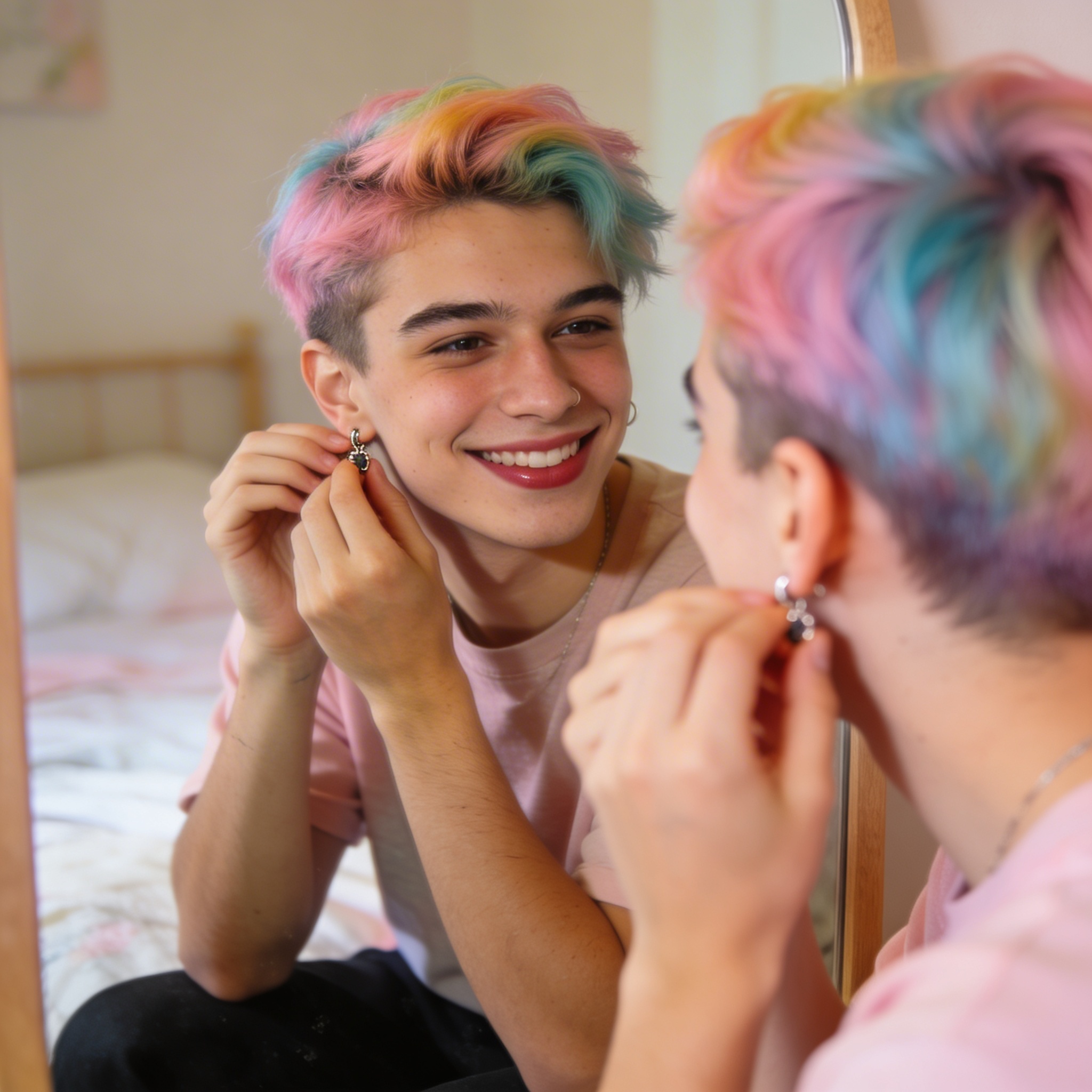
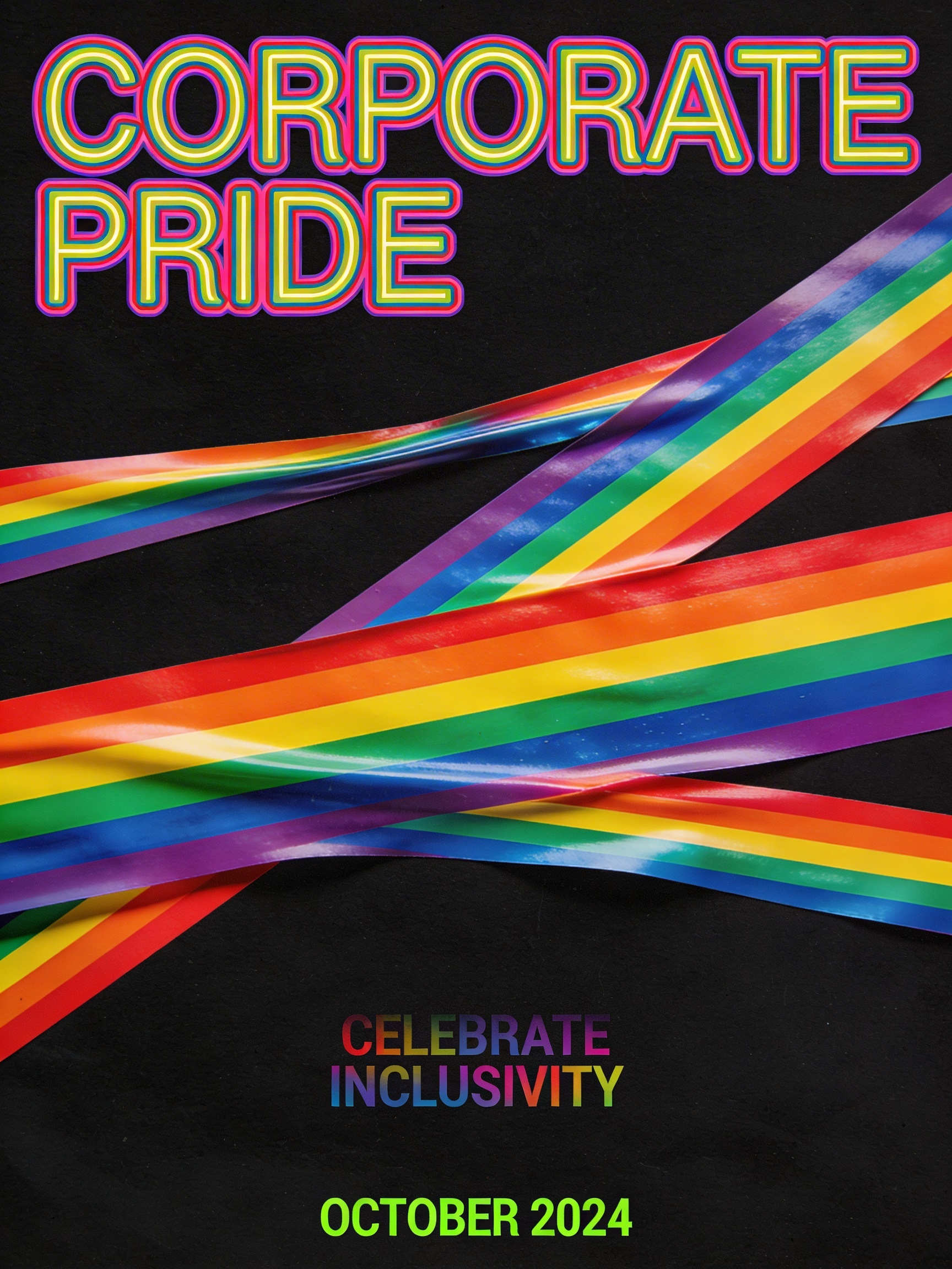
Gaydar is a dating app built by and for the LGBTQ+ community. Not a replica of what's already out there. Not a corporate afterthought with a rainbow logo slapped on in June. Built from day one to serve the full spectrum of queer identity.

We exist because our community deserves a space where you don't have to explain yourself, where safety isn't an add-on, and where the design reflects who we are: bold, diverse, unapologetic, and full of life.

"We're not copying what other dating apps do. We're building something more inclusive, more intentional, and more dynamic -- because our community deserves it."

Mission

To create the safest, most authentic space for queer people to find connection -- romantic, social, and everything in between.

Vision

A world where every LGBTQ+ person can show up as themselves and find their people.

What Makes Us Different

Trust-first. Verification, safety, and privacy aren't features -- they're the foundation.

Community-rooted. We listen. We evolve. We build what our people actually ask for.

No compromises. We don't water ourselves down to be palatable.

Brand Personality

Bold Inclusive Warm Playful Honest

Personality in Practice

TraitWhat It MeansNot This
BoldConfident and direct. We say what we mean.Aggressive or exclusionary
InclusiveThe full spectrum of queer identity -- every letter, every shade, every story.Performative or tokenizing
WarmHuman first. This is a community, not a platform.Robotic, cold, or corporate
PlayfulHumor is part of who we are.Careless about safety or trust
HonestWe own our mistakes. We talk to people, not at them.Hiding behind PR speak
01 Dating apps keep missing what our community needs.
02 The identities get flattened. The connections feel transactional. The space never feels like ours.
03 We need a space designed for all of us -- every identity, every expression, every connection.
We built
something better.

Every feature -- from how gender works to how profiles appear -- was designed for queer connection from day one. Inclusive, intentional, and dynamic.

02 -- What We Believe

The non-negotiables.

These aren't marketing talking points. They shape every decision we make.

01

Representation Matters

The LGBTQ+ community isn't a monolith. Gay men, lesbians, bisexual people, trans folks, nonbinary people, queer people of color, people with disabilities, people of every body type and age -- everyone sees themselves in Gaydar. This applies to our imagery, our language, our features, and who we hire.

02

Safety Is Non-Negotiable

Our community faces real threats -- online and off. We build with that reality in mind. Verification, reporting, blocking, and privacy controls exist because they have to, not because they look good on a feature list.

03

No Rainbow-Washing

We don't slap a rainbow on everything and call it representation. We earn our place in this community through action -- through the product we build, the people we hire, the causes we support, and the way we show up every single day. Pride isn't a marketing campaign. It's who we are.

04

Joy Over Fear

Yes, safety matters. But Gaydar is ultimately about joy -- the excitement of a new match, the warmth of finding your people, the thrill of connection. We lead with what's beautiful about being queer, not what's hard.

03 -- The Deconstructed Rainbow

The rainbow is our DNA,
not our uniform.

The rainbow isn't absent from Gaydar -- it's embedded. It's been taken apart and distributed across the brand so that no single touchpoint screams "pride flag," but if you step back and look at everything together -- the logo variations, the gradient atmospheres, the accent moments -- the full spectrum is there. You have to find it.

This is the opposite of rainbow-washing. It treats the rainbow as something sacred enough to earn, not something cheap enough to slap on a banner. You have to piece it together across touchpoints. That's the point.

"You'll never see it all at once -- but if you look at everything we've ever made, it's all there."

What This Means

The logo appears in one color at a time -- green on the app icon, pink on a social post, blue on a merch drop, gold on event branding.

Brand gradients use two or three spectrum colors per composition, never all of them.

A social media grid assembles the rainbow post by post. A merch line collects the spectrum item by item. Seasonal campaigns can own a color -- summer is golden, winter is sky blue.

Pride month might be the one time multiple colors appear closer together, and even then, subtly.

05 -- Color System

Spectrum on dark.

Gaydar's look is unmistakable -- vivid color moments on deep black. Bold without being loud. Modern without being cold. Green leads, but the full spectrum lives underneath.

Primary Brand Colors
Signal Green #00FF00 The signature. Logo, online dots, badges, highlights.
Action Green #30D158 Buttons, send, confirm -- anything you tap.
Action Pressed #28B54C Pressed/active button state.
The Spectrum Palette
Presence #00FF00 The signal. I'm here, I'm visible.
Spark #EF4444 Chemistry, desire, the moment it clicks.
Radiance #F59E0B Celebration, pride, golden hour warmth.
After Dark #A855F7 Nightlife, exclusivity, evening energy.
Trust #3B82F6 Safety, verification, the foundation.
Dark Surface Palette
Canvas #000000 Root background. Pure black, OLED-off.
Near-Black #050505 Gradient canvas. Just enough warmth.
Surface 1 #0D1117 Cards, list items.
Surface 2 #141414 Elevated cards.
Surface 3 #1C1C1E Sheets, modals.
Surface 4 #2C2C2E Input fields.
Functional Colors
Match / Destructive #EF4444 Match flame, delete, errors.
Warning #F59E0B Caution, expiry, time-sensitive.
Info #3B82F6 Verification badges, informational.
Premium #A855F7 Special, Pro features.
Color Balance: 70-20-10
70%
20%
10%
70% Dark

Backgrounds, space, breathing room. The dark canvas is what gives color its power.

20% White & Gray

Text, UI elements. The structural layer that makes content readable.

10% Color

The moments that matter. Color is powerful because we use it sparingly. When everything glows, nothing does.

Floating Gradient System

The brand uses a library of ambient atmosphere layers -- soft radial and linear glows floating on near-black canvases. They're not backgrounds. They're moods. Like colored light drifting through a dark room. The effect is bioluminescent.

Warm Glow Primary -- hero, defaults
Blush + Glow Romance, connection
Twilight Privacy, trust, calm
Spectrum Drift Identity, inclusivity

Accessibility

Every text/background combination meets at least AA contrast.

CombinationContrastGrade
White on Black21:1AAA
Signal Green on Black8.6:1AAA
Gray text (#A3A3A3) on Black7.4:1AAA
Action Green on Black6.1:1AA
06 -- Typography

Type system.

In Brand Materials

Archivo Black for display headlines -- bold, confident, fills the space. DM Sans for body text -- clean, friendly, highly legible. This pairing is used on the website, marketing materials, social content, and print.

In the App

System fonts only -- SF Pro on iOS, Roboto on Android. The app should feel native to the device. No custom fonts to load, no rendering inconsistencies.

Display -- Archivo Black
Aa Bb Cc
ABCDEFGHIJKLMNOPQRSTUVWXYZ
abcdefghijklmnopqrstuvwxyz
0123456789 !@#$%&
Body -- DM Sans
Aa Bb Cc
ABCDEFGHIJKLMNOPQRSTUVWXYZ
abcdefghijklmnopqrstuvwxyz
0123456789 !@#$%&

Type Scale (App)

Big Moments 37px / Bold / splash, celebrations Welcome
Screen Titles 28px / Bold / top of every screen Radar
Section Headers 23px / Semibold / breaking up content Nearby
Body Text 16px / Regular / the default The quick brown fox jumps over the lazy dog.
Labels 14px / Medium / metadata, timestamps 2 miles away
Small Print 12px / Medium / badges, tags VERIFIED

Text Hierarchy on Dark

Text uses an opacity hierarchy rather than color changes.

Primary 100% white -- Names, headings, key content
Secondary 80% white -- Descriptions, captions
Tertiary 60% white -- Timestamps, hints, metadata
Disabled 40% white -- Inactive tabs, greyed labels
Accent Signal Green -- Links, CTAs only, never body copy
07 -- Photography & Imagery

Real people.
Real moments.

Laughing with friends at brunch. Holding hands on a walk. Getting ready to go out. The quiet moment before a first date. Our photography captures joy, connection, and belonging -- not loneliness, not thirst traps, not stereotypes.

LGBTQ+ couple at golden hour
Two women connecting
Diverse LGBTQ+ friend group
Everyday quiet moment
Confident portrait

Photographic Direction

Do
  • Warm light. Natural, golden hour, soft. Not clinical.
  • The full community -- across race, gender identity, age, body type, ability, and expression.
  • Joy, connection, belonging. These are the feelings.
  • Explicitly LGBTQ+ subjects -- same-sex couples, queer groups, trans individuals. No straight-passing stock.
  • Candid moments over posed compositions.
Don't
  • No clinical or harsh flash lighting.
  • No generic stock photography. If it could be on any app, it doesn't belong on Gaydar.
  • No stereotypical or reductive imagery.
  • No over-filtered or heavily color-graded photos.
  • No imagery centered on loneliness or isolation.
08 -- Voice & Tone

How we speak.

We talk like a friend who happens to be building an app, not like a corporation that happens to serve queer people. Approachable but not sloppy. We know when to be fun and when to be real. We have personality and we're not afraid of it.

Dimension 1 Direct

We say "You matched." not "A match has been found for you!" Short sentences. Active voice. No hedging. If something broke, we say "Something went wrong. Try again?" not "We apologize for any inconvenience."

Dimension 2 Inclusive

We say "Find your people" not "Find your man." Every word is checked for assumptions about gender, orientation, relationship structure, and identity. We welcome the full spectrum.

Dimension 3 Human

We say "We're building this together" not "The platform facilitates connections." We're a community first. The language should feel like it comes from a person, not a product spec.

Dimension 4 Witty

We say "Your radar is heating up" not just "New profiles nearby." Humor is part of who we are -- but it never comes at anyone's expense. Playful, never mean-spirited.

Tone by Moment

Welcome

"Welcome to Gaydar. Find your people."

Match

"It's a match!"

Something Broke

"Something went wrong. Try again?"

Nobody Around

"Your radar is scanning..."

Safety & Privacy

"Your privacy is non-negotiable."

Notifications

"Someone's nearby. Open your radar."

Language We Don't Use

Say This
vs.
Not This
"Community," "identity"
vs.
"Lifestyle"
"Orientation," "identity"
vs.
"Preference"
"People," "community," "members"
vs.
"Users" (in marketing)
"Gay," "queer"
vs.
"Homosexual"
"Trans people," "transgender people"
vs.
"Transgenders" (as noun)
"Different," "new"
vs.
"Revolutionary"
"Use"
vs.
"Leverage"
"Smooth," "easy"
vs.
"Seamless"

Taglines

Primary -- App Stores, Marketing, Everywhere

"Find your people."

Campaigns, Landing Pages

"Find your people."

In-App Moments

"Your radar is on."

09 -- Layout & Grid

Space & structure.

Design Philosophy

Depth comes from elevation, not shadows. Things rise off the black canvas by getting incrementally lighter. The interface breathes -- generous whitespace lets content and color moments land with impact.

Spacing Scale

--space-xs
4px
--space-sm
8px
--space-md
16px
--space-lg
32px
--space-xl
64px
--space-2xl
96px

Border Radius

Rounded but not bubbly. The brand uses moderate radii that feel modern without losing authority.

0px
4px
8px
12px
Full

Surface Elevation

Canvas #000000
Surface 1 #0D1117
Surface 2 #141414
Surface 3 #1C1C1E
Surface 4 #2C2C2E
10 -- Brand Don'ts

What we never do.

These protect the integrity of the brand and the trust our community places in it.

Rainbow flag misuse
Don't use the full rainbow flag or rainbow stripes. The spectrum is deconstructed, never literal.
Too many colors
Don't use more than three spectrum colors in a single composition.
Green overload
Don't use Signal Green (#00FF00) as body text or large backgrounds. It's an accent, not a surface.
Light background misuse
Don't use light backgrounds unless required for print or legal documents.
Bad stock photography
Don't use stock photography that could appear on any dating app. If it's not explicitly LGBTQ+, it doesn't belong.
Corporate language
Don't use language that is passive, vague, or corporate. We talk to people, not at them.

Typography Don'ts

  • - Don't use fonts other than Archivo Black and DM Sans in brand materials.
  • - Don't use custom fonts in the app. System fonts only.
  • - Don't use Archivo Black below 24px. It's a display font.

Color Don'ts

  • - Don't use gradient peaks above 55% opacity. Most of the surface must remain dark.
  • - Don't place two high-opacity glows adjacent. Leave dark space between them.
  • - Don't add colors outside the approved spectrum and functional palette.

Find your people.

Gaydar exists to help people connect -- authentically, safely, and without compromise. We're building a space where every identity belongs, where community isn't a buzzword, and where finding your people is the whole point. Not algorithms. Not engagement tricks. Just real connection across the full spectrum of who we are.

Brand Inquiries
Gaydar Brand Guidelines Version 1.0 -- 2026 Developed by The Gaygency